

Icons are graphical representations of functionality, concepts, a specific entity, and the application itself in user interfaces. Users navigate an interface intuitively with the help of icons, which act as a visual guide.
There are no wrong answers to this question. It depends on the process you want to follow and the methods you want to use. There are many different ways in which you can create an icon. I will share the process I followed to create the icons for a product based on spend management.
Recently we redesigned our mobile app experience and interface. Creating new icons was one of the requirements. So we decided to build a new icon library in Figma that we used in the mobile and web app.
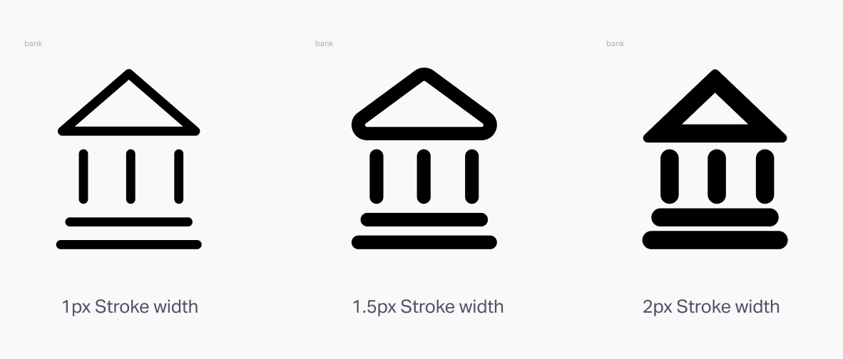
The first step in creating an icon is to determine the dimensions of the icons in pixels. There are a lot of different dimensions with which icons can be created.
There can be a lot of different canvas sizes depending on the platform for which you are designing the icon.
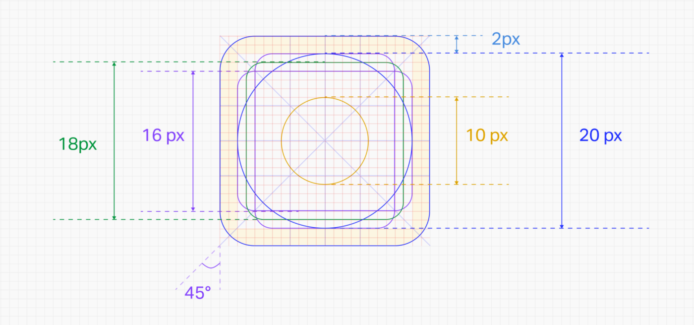
Start by deciding on icon grids and KeyLines. It will help establish clear rules for graphic elements’ consistent but flexible positioning.
KeyLine shapes are essential to maintain consistent visual proportions across all icons.
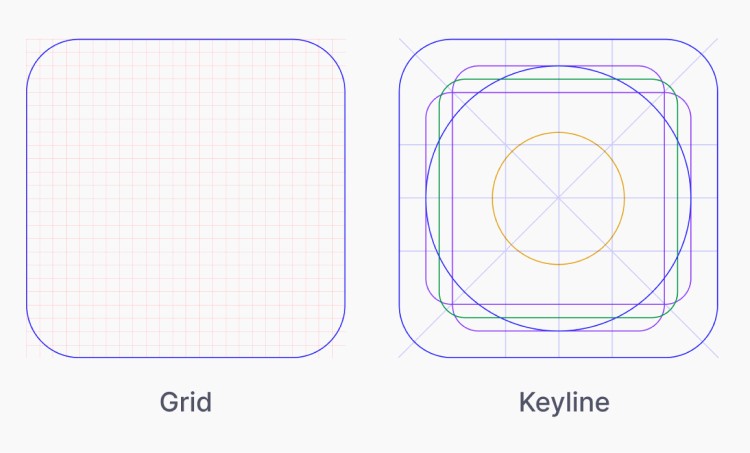 Difference between Grid and Keyline (Image Inspiration from Material Grid and Keyline shape)
Specific shapes like squares, circles, rectangles, and diagonals will help us create more consistent icons and unify the placement of these shapes across icons.
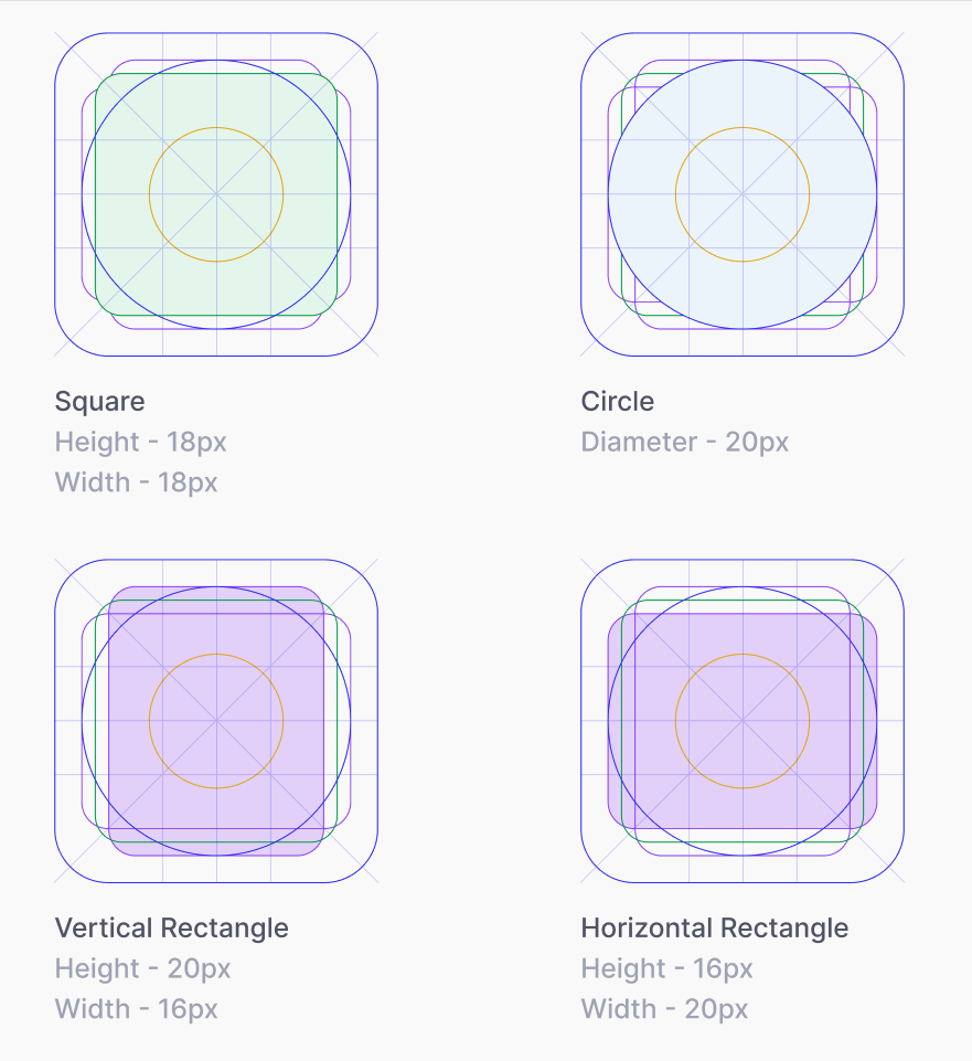 Dimension of shapes inside Keylines (Image Inspiration from Material Grid and Keyline shape)
The live area is the space where the main content of the icon is present. If required, the content of the icon can extend to the trim area, but it should not extend outside the trim area.
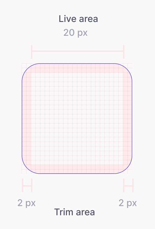 Depiction of Live area and Trim area (Image Inspiration from Material Grid and Keyline shape)
Once we have created the icon guide and keyline, we can decide on the type of icon we want.
There are different types of icons -
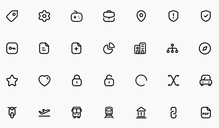
1. Outline Icons —Icons of this type are created by using only the stroke.
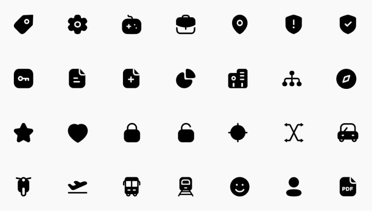
2. Filled Icons — Both strokes and fill are present in these kinds of icons.
3. Dual-tone Outline Icons — Icons that have dual tones are made by using 2 different colors on the stroke.
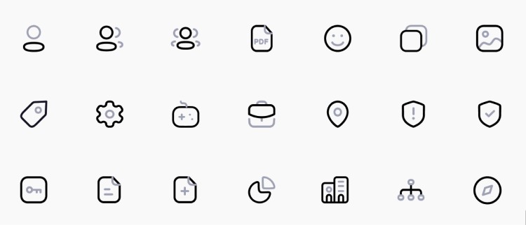
4. Combination of Outline and Filled Icons — It is possible for these types of icons to coexist with Outline icons and Filled icons. Their function is typically to indicate whether the state of an object is Active or Inactive.

In the same way, icons can have a variety of styles. The style depends on the icon library. As we were supposed to create clear and understandable icons, I chose outline icons and a few filled icons to show the active status.
You can create icons in various ways, but in this post, I’ll tell you about the process I followed to build an excellent icon library that I’m proud of 😎.
Here’s a tutorial on designing a cog icon which is generally very tricky to design, and it took me some time to understand and do it in ~3 min at the end:)