

Heuristic Evaluationis a method where an expert audits a Website/App for Usability Problems using the Principles of Heuristic.
We did a detailed heuristic evaluation on the mobile app and got to know that there were a lot of Usability Issues in our mobile app.

We started collecting data and forming hypotheses. A lot of interesting results came from data.
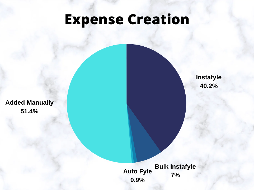
We collected data for the past 3 months on how users are creating a new expense from the mobile app. Data analysis showed us that only 40.2% of users are using Instafyle. This indicates that Instafyle which has been a core feature of the mobile platform is losing out the importance in the existing design in terms of discoverability because of which most users preferred to fill out the expense form manually.
When a user submits an expense, It has to be approved by an Approver. Improving the approver’s flow was also one of the priorities in this redesign. So we collected data on how many reports are approved by approver in both the platforms. Data says only 8.3% of reports are getting approved using the mobile app. This implies low discoverability of this option on mobile app or approver finds it easy to do it on the web than the mobile app.

Similarly, we also collected data around — how many reports are being submitted in a month per user, what is the most claimed currency, Usage of a particular feature, etc. As a result, we realized that the usage patterns were very different from what we had anticipated.
We were able to apply the learnings from the data to develop a more user-centric flow instead of creating what we envisioned would be useful for our users.
Competitive research and other research helped us to understand that instead of reinventing some new way to perform a task it is always better to follow the existing user behavior which is familiar to the users.
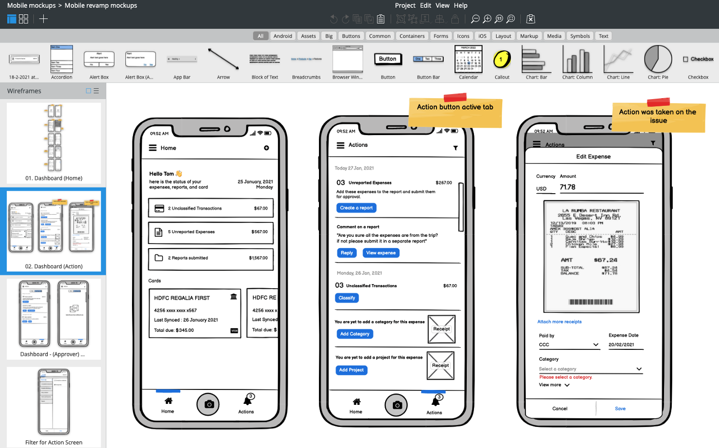
We had a lot of research, data, and hypotheses up to this point and we were somewhat clear on the flow. The next step will be to start creating wireframes and design suggestions. Explored a number of ideas and iterated on a few before moving on to the High Fidelity Design phase.

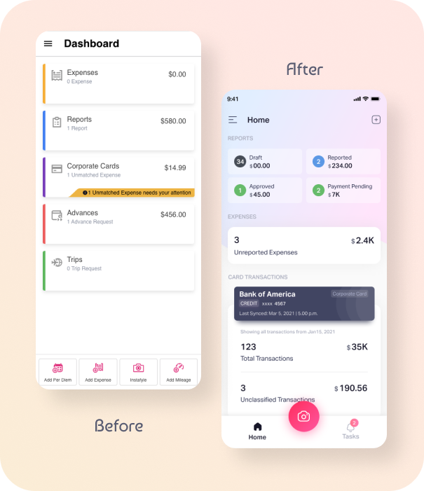
Wireframe to high fidelity design transition was straightforward because the flow had already been decided. The emphasis shifted more to interaction and creating visually pleasing designs for this phase.
Designs and flows were tested by a lot of users, and we observed how users interacted with the app. It helped us validate our hypotheses. We improved the designs based on the feedback we received during user acceptance testing.

My mentors in this initiative were Swapna Ranjita Nayak and Yashwanth Madhusudan. Through their guidance, I learned how to approach a project of this magnitude. Swapna assisted me in creating quality designs and design documentation. I was able to reach her for assistance whenever I encountered problems. Throughout this initiative, she extended her helping hand with her knowledge and resources.
Irfan Alam helped me a lot by quickly providing the data whenever required. Last but not least thanks to my fellow designers and users who helped us by giving their valuable feedback.